back to our work

Élanys

Brazil

sector
HR, behavioral assessment platform
client
Élanys
scope
naming, brand and applications
year
2026

Élanys is an HR platform with more than 70 behavioral assessment tools, a validated scientific base and the psychosocial risk management that Brazil's NR-1 regulation now requires. The product was ready. It needed a brand that could carry that weight.
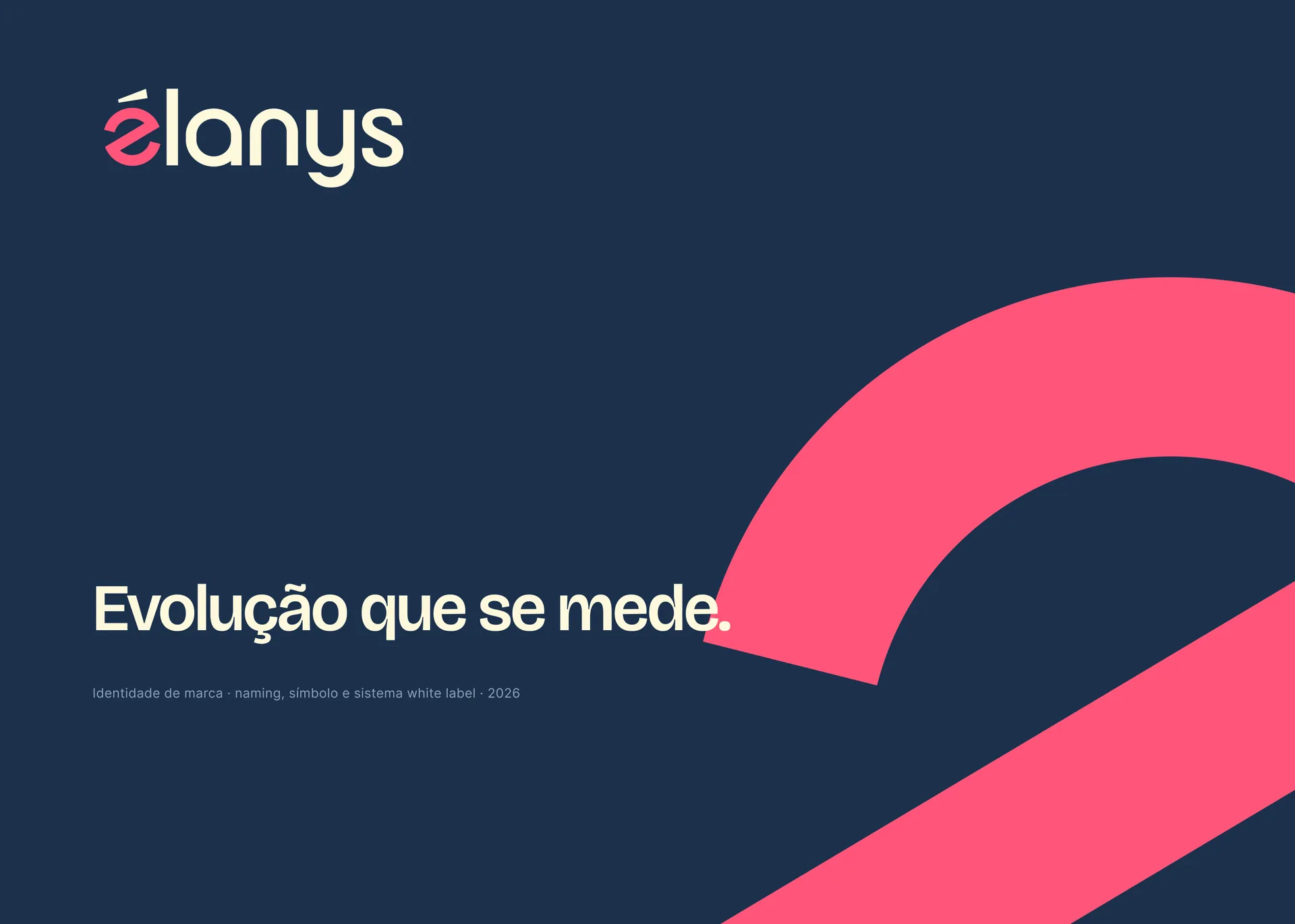
Élanys project cover: the logo in cream on navy, the line Evolução que se mede. and the pink symbol cropped at the edge.

Scientific rigor and human warmth in the same brand.
the challenge

Behavioral assessment tools tend to sound either clinical or corporate. Élanys needed both at once: the rigor that convinces the buying committee and the warmth that makes employees answer honestly. The brand also had to work when a consultant sells it with another company's name up front.

from portrait to movement

Most of these tools answer the question “who are you?”. Élanys starts from that answer and shows where the person, the team and the company can go. The whole brand came from that idea, and the question behind every piece is “where are you heading?”.

the name

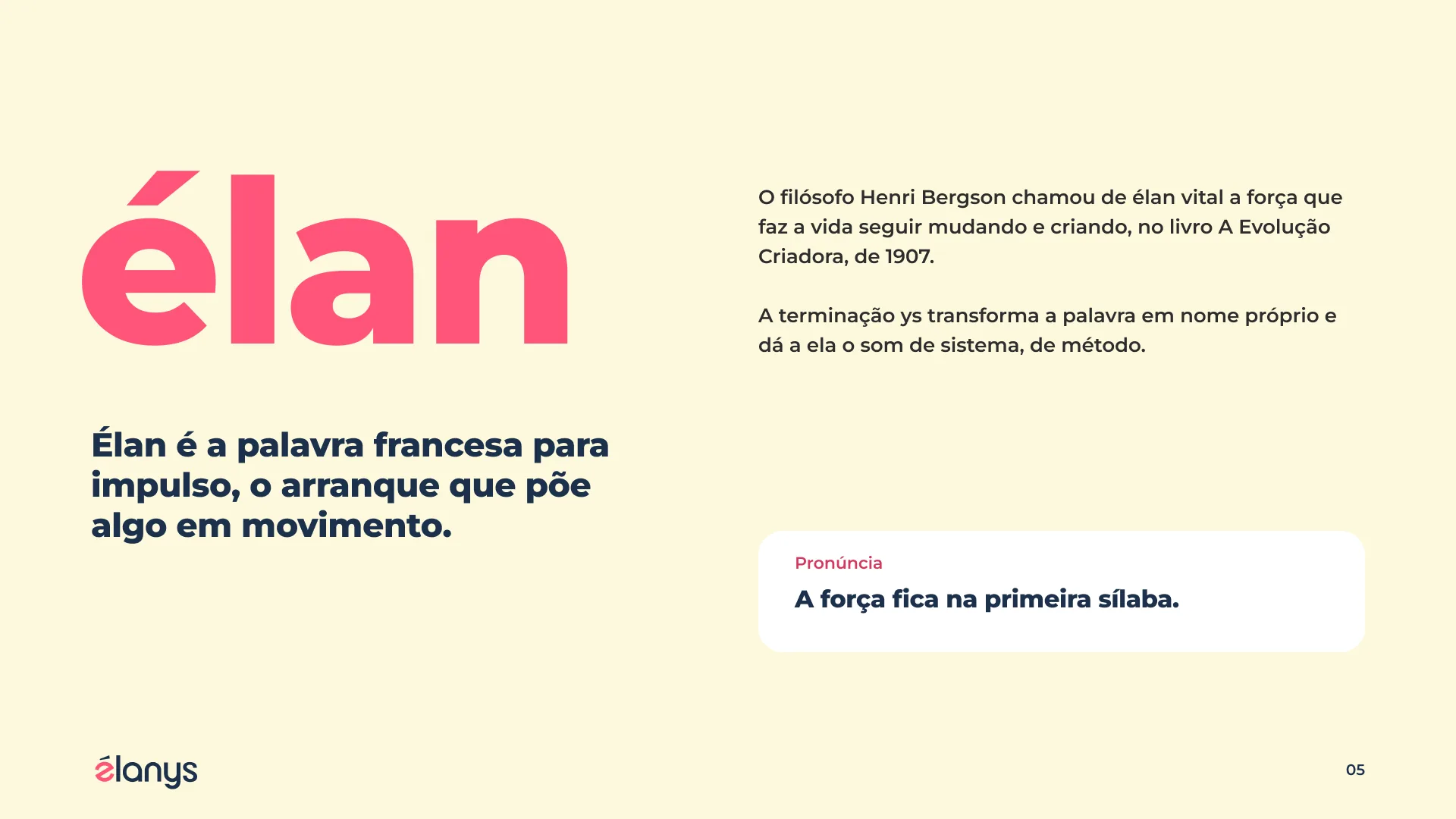
Élan is the French word for impetus, the push that sets something in motion. Bergson called élan vital the force that keeps life changing. The ys ending turns the word into a proper name and gives it the sound of a method. The signature line, “Evolução que se mede.” (progress you can measure), closes the case HR has to present.

The name page: the word élan in pink, explained as the French word for impetus.

the symbol

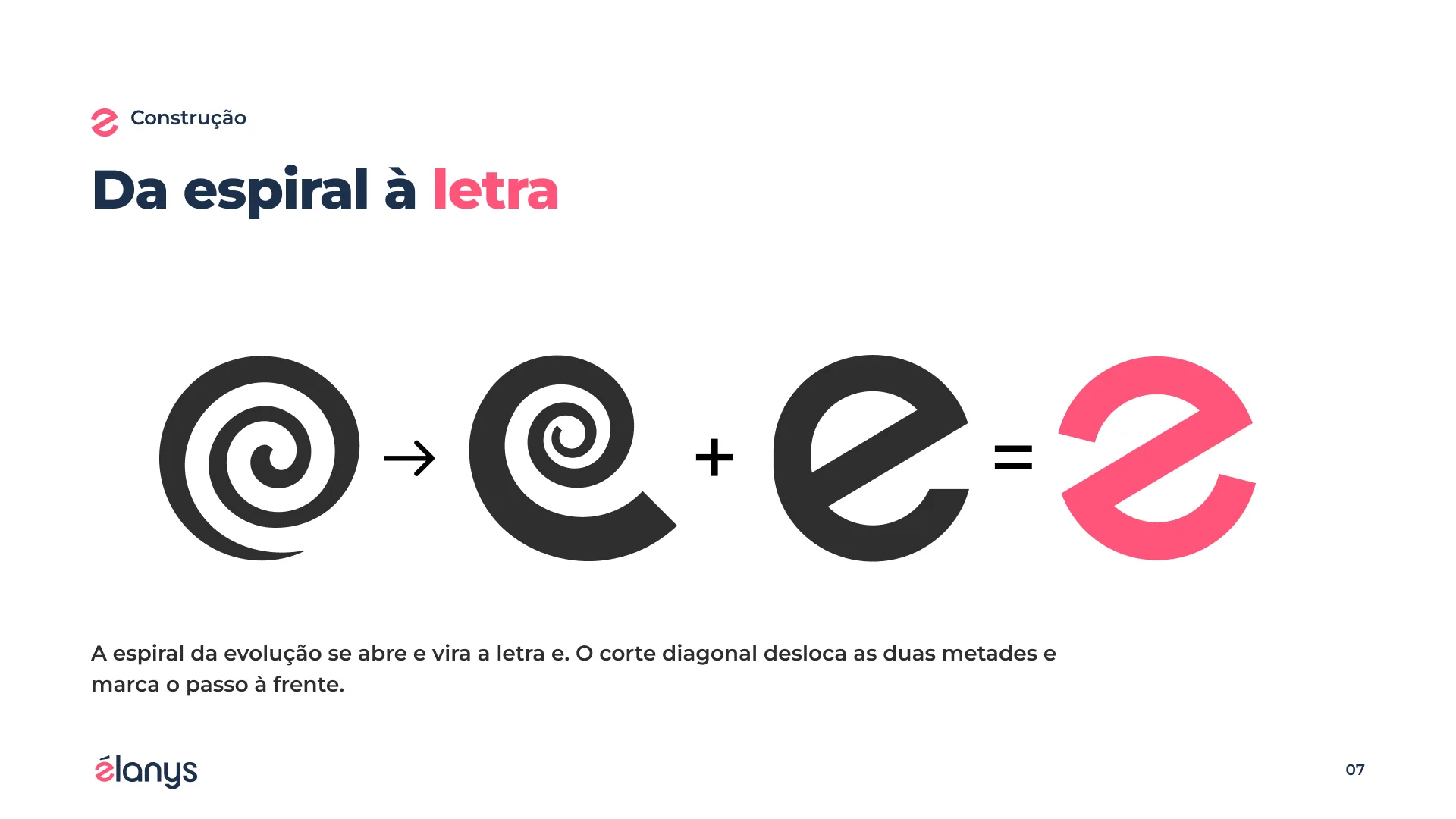
A spiral, the shape of growth: in a nautilus shell each turn is larger than the last and keeps its proportion. A diagonal cut marks the moment of change and leaves the form open. The spiral opens up and becomes the first letter of the name, the only one in pink.

Symbol construction: the spiral opens, takes a diagonal cut and becomes the letter e in pink.

one brand, many backgrounds

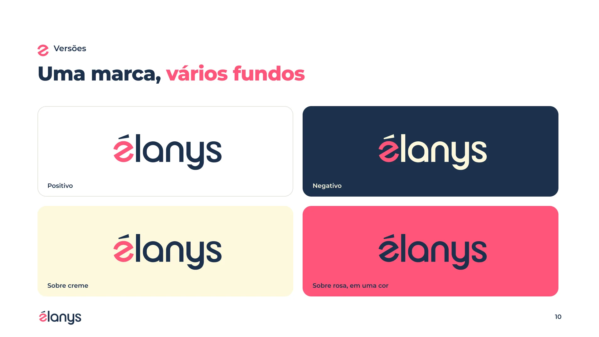
The signature works in positive, in negative, on cream and in a single color. Three colors, each with a job: navy for trust and rigor, pink for energy and impetus, cream for warmth.

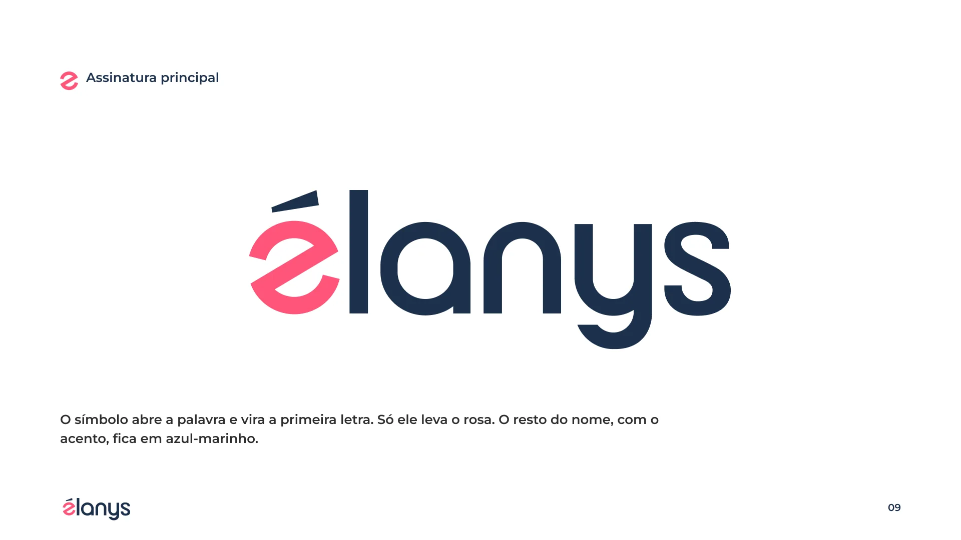
Main signature: the pink symbol opens the word élanys, set in navy.
Four versions of the logo: on white, on navy, on cream and in a single color on pink.
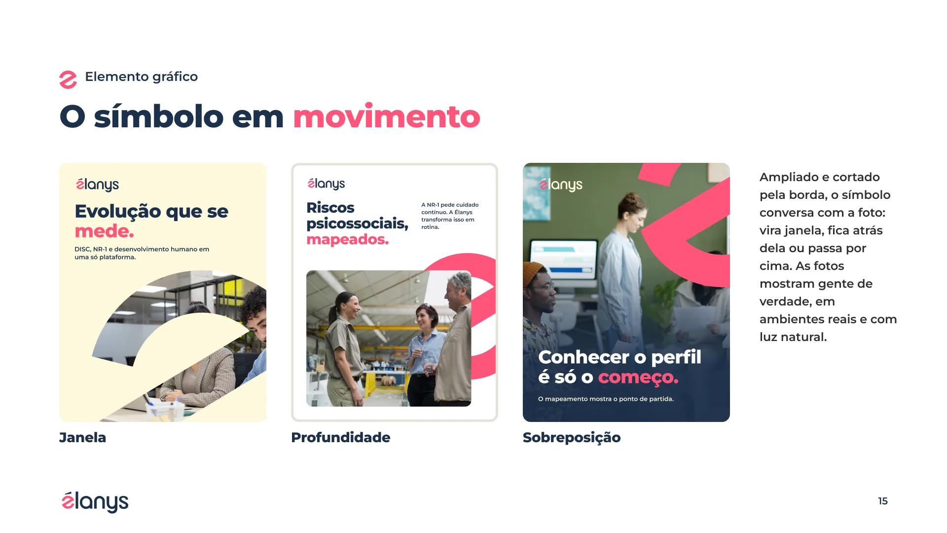
The symbol in motion: three pieces where it becomes a window onto the photo, sits behind it or runs over it.

the brand in use

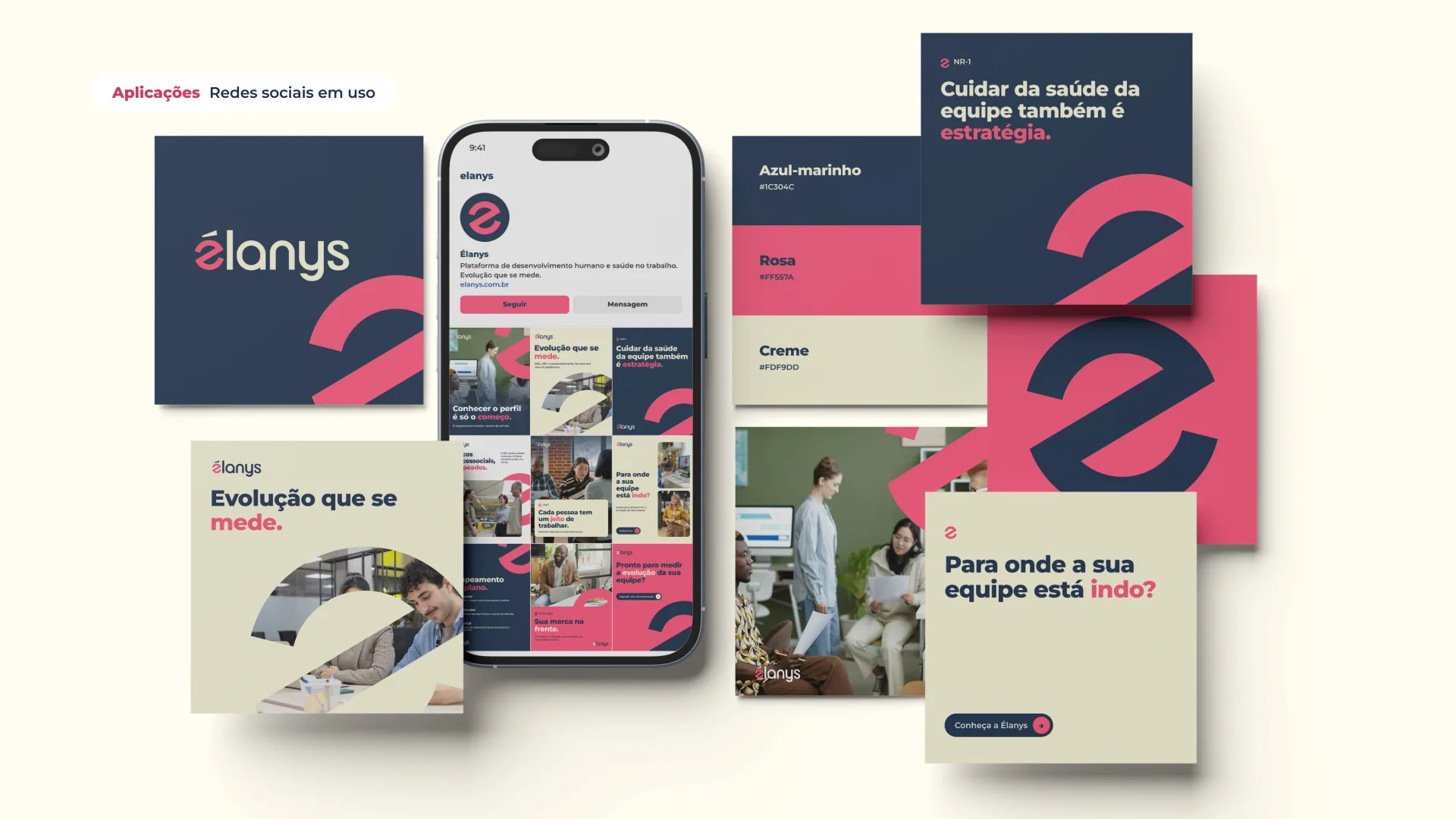
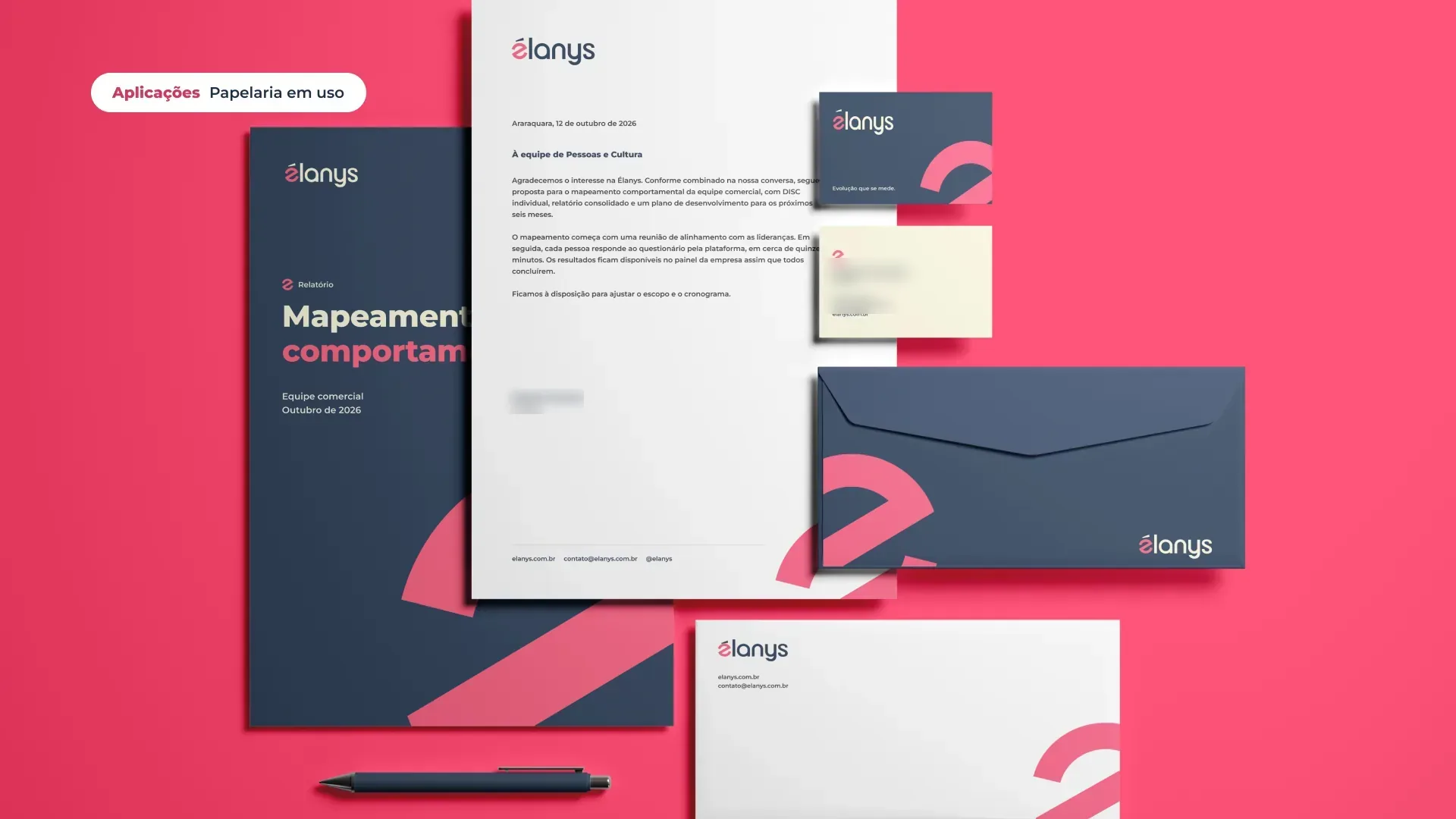
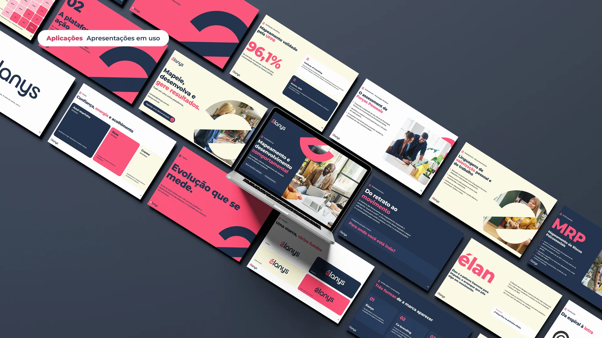
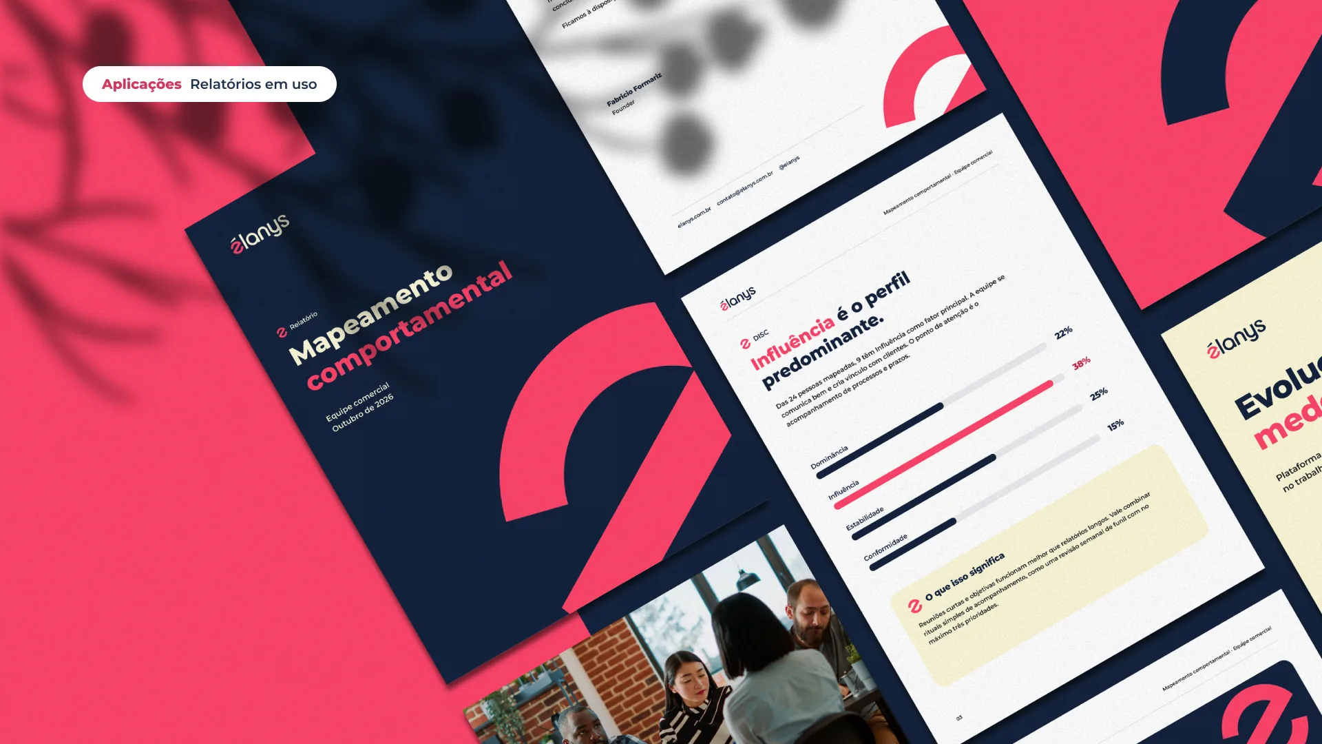
Enlarged and cropped at the edge, the symbol becomes a window onto the photo, sits behind it or runs over it. Social media, stationery, the sales deck and the report all come from the same system, with no new artwork for each piece. The report needed the most care: it is what the client takes away, with the assessment, the NR-1 figures and the action plan, and it had to read as a technical document without feeling cold.

Élanys social media pieces in navy, cream and pink, with a phone showing the profile.
Élanys stationery on a pink background: letterhead, folder, envelope and card.
Pages of the Élanys sales deck laid out diagonally.
Élanys behavioral assessment report: navy cover and inside pages with charts.

three ways the brand appears

Élanys is also sold by consultants who take the platform to their own clients.

  • Élanys

    Direct sale. The brand appears in full on every piece.

  • Shared brand

    The consultant's brand comes first, and a “powered by Élanys” seal signs the footer.

  • Consultant only

    The end client sees only the consultant's brand. Élanys stays behind the scenes.
more cases

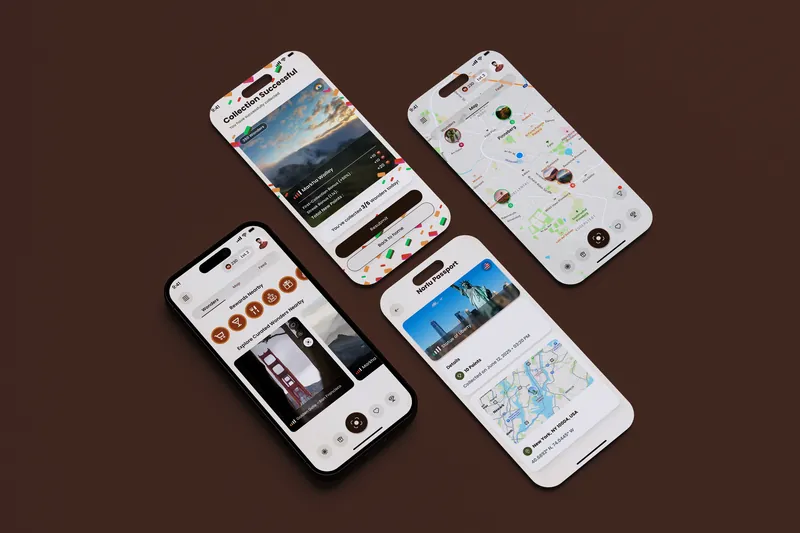
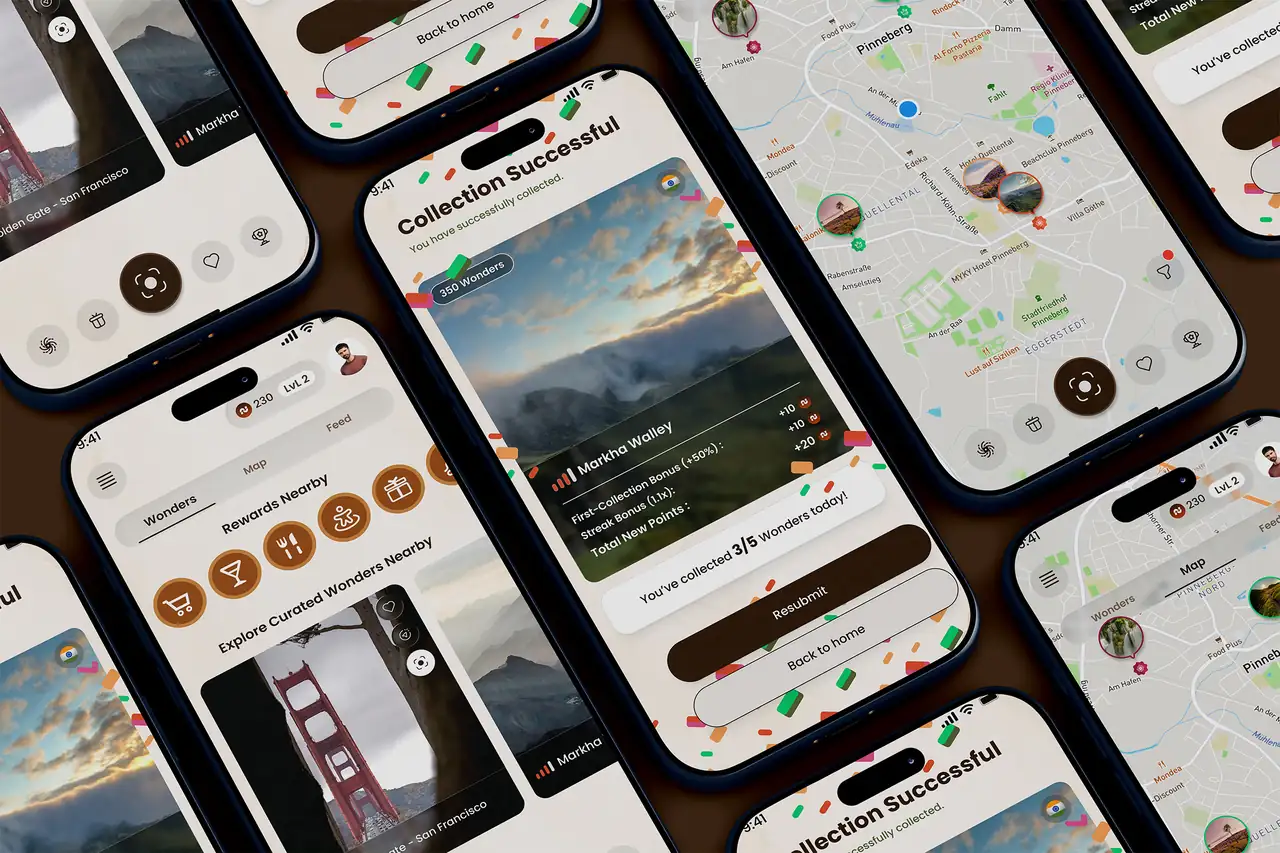
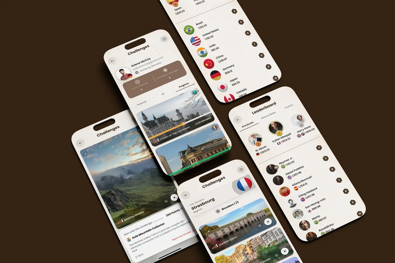
  1. Norlu travel: audit and redesign, version 2.0 live Norlu app screens
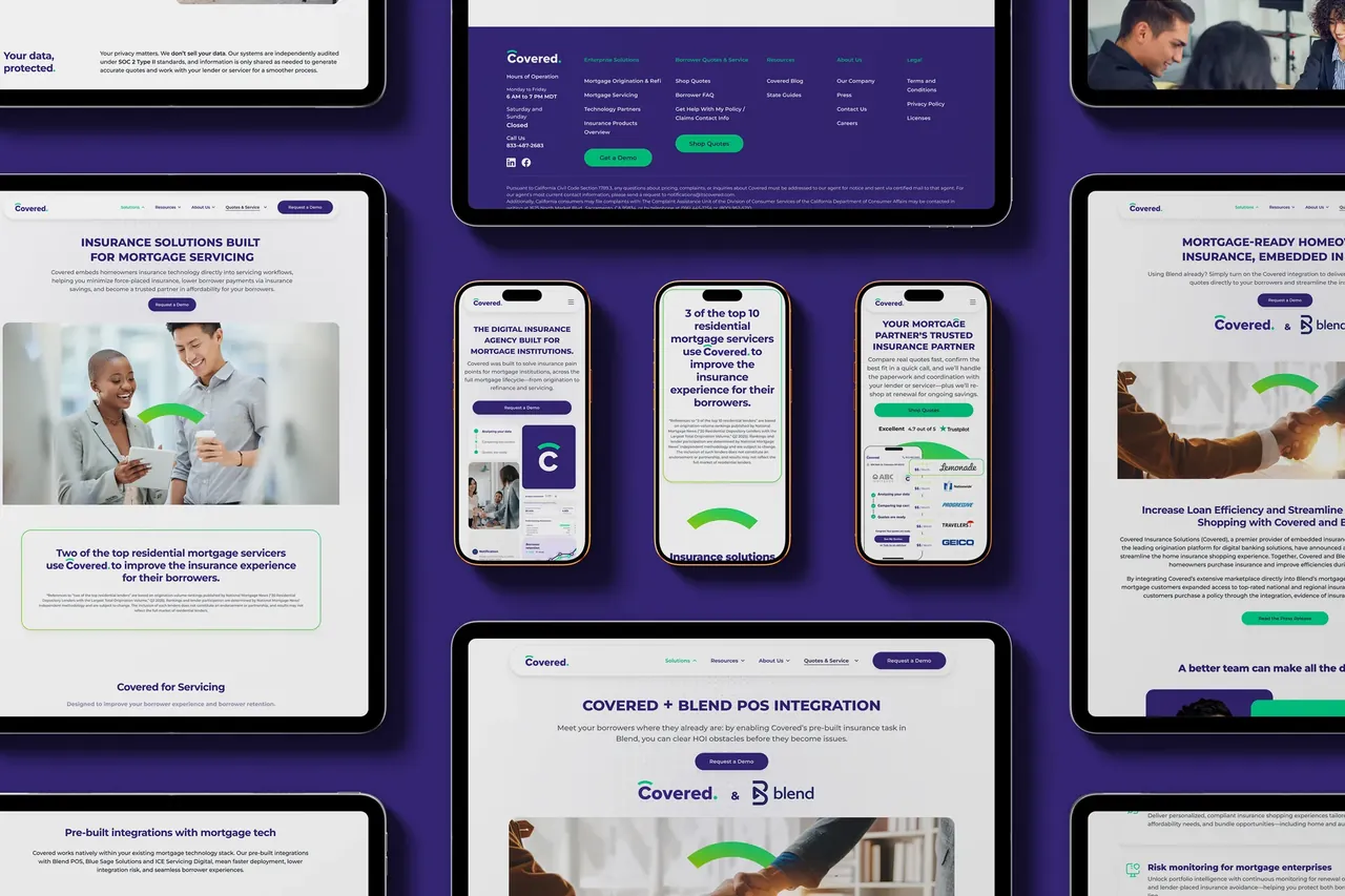
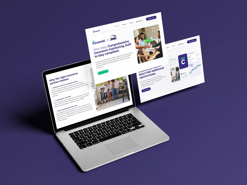
  2. Covered insurance: website, design system and brand, since 2025 Covered website on several screens

Tell us the problem.

A scheduled call: you describe the problem and we tell you whether it is worth building.

Prefer to ask a few questions first? Ask our AI agent